CR Land Office Environment Design: Minimalist Office Furniture
CR Land Office Environment Design: Minimalist Office Furniture and Customized Space Optimization Design Host: Li Zizhao
Design team: Xia Pengjun, Zhang Gongfa, Zhi Wanqing, Zhao Zhiyuan, Yang Nan
Owner team: Hao Tonghua, Zhu Yanting, Zhang Sixiao, Zhang Chenggong, Chen Hongjuan, Ma Zengliang, Zeng Minmin
Address: Beijing, China
Area: Approximately 1920 square meters above ground and 1300 square meters underground
Keywords: Office environment design, office furniture, real estate, Beijing, China, minimalism, smoke orange tone, acoustic design, composite space, carriage booth, private office
Order Construction in Office Environment Design
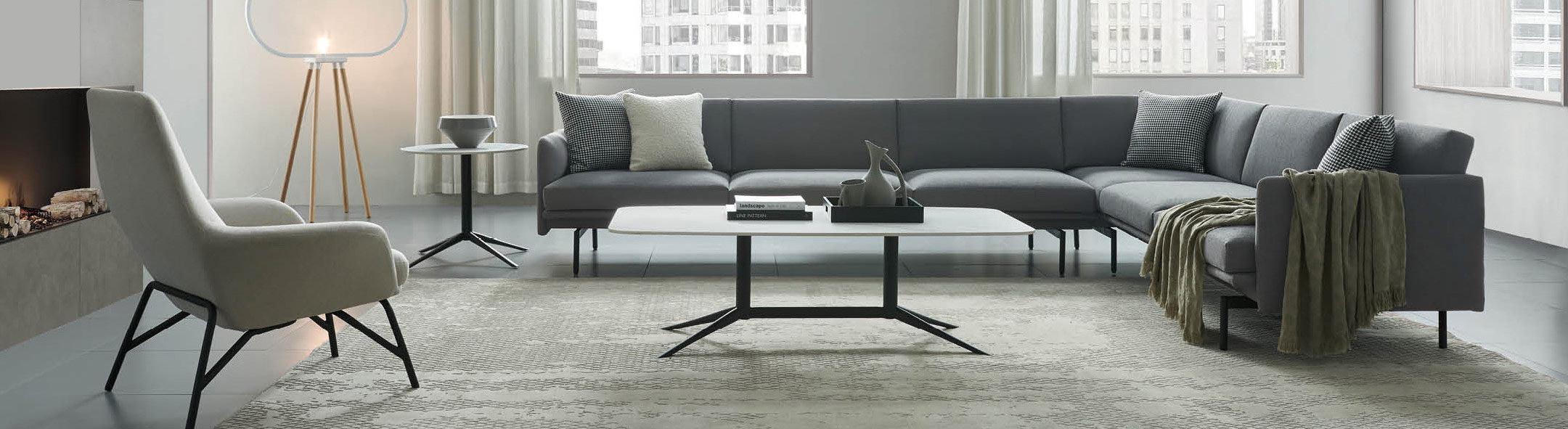
The reception hall is dominated by large areas of neutral gray and white terrazzo, paired with silver gray metal mesh, creating a modern industrial style. The large-scale artificial stone reception desk embodies minimalist lines and enhances the sense of spatial order. The rest area adopts a combination of beige and orange office furniture, such as art sculpture sofas and booths, to enhance the waiting function while lighting up the visual.
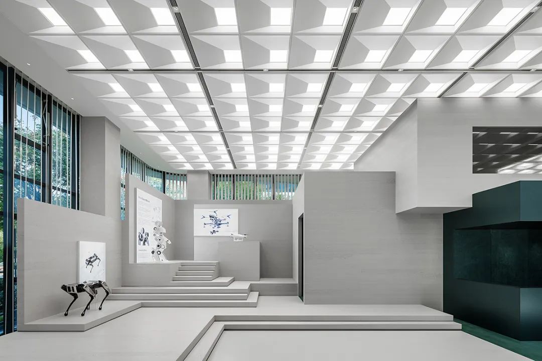
The top sound-absorbing panels arranged in an orderly manner enhance the acoustic design in the corridor, connecting different areas and ensuring a clean and bright office environment.
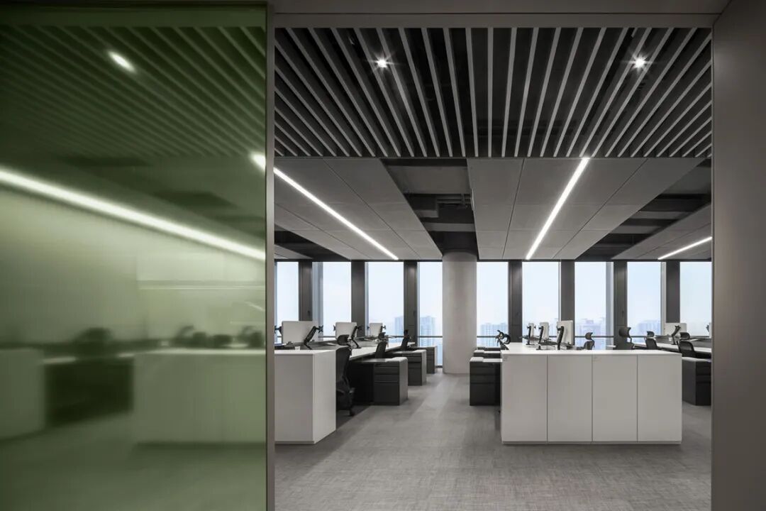
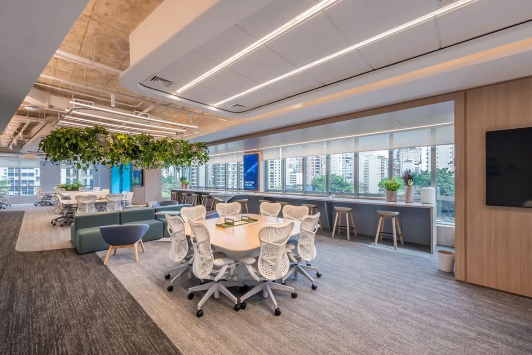
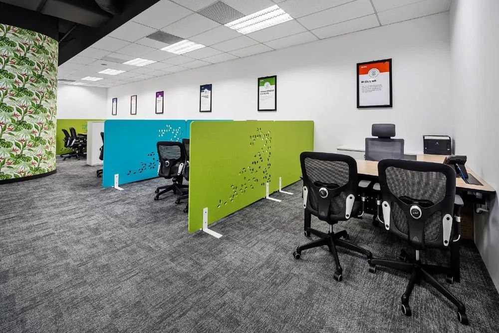
Efficient integration of rational field and office furniture
The layout of the office space emphasizes consistency and sequence, with a window bar and minimalist leisure art furniture providing flexible work switching points. Vitality orange, as the theme color, runs through the corridors and office areas, highlighting the artistic expression of office environment design. Customized furniture such as geometric shaped tops and functional booths, supporting efficient office work and short breaks.
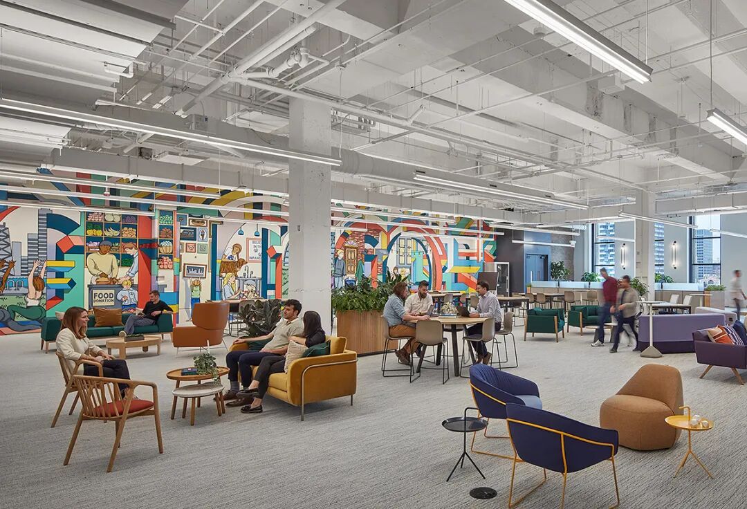
Creative Box: Customized Furniture with Multiple Combinations
The "box" unit composed of gray back painted glass, combined with soft fabric furniture and low saturation colors, reflects the extensibility of customized furniture. The circular metal pendant light enhances the industrial style, while the nested design of the water bar displays color changes, meeting the needs of sharing and privacy.
Optimization of Multi dimensional Space and Office Environment Design


 Chinese
 English
 French
 Spanish
 Russian
 Arabic